
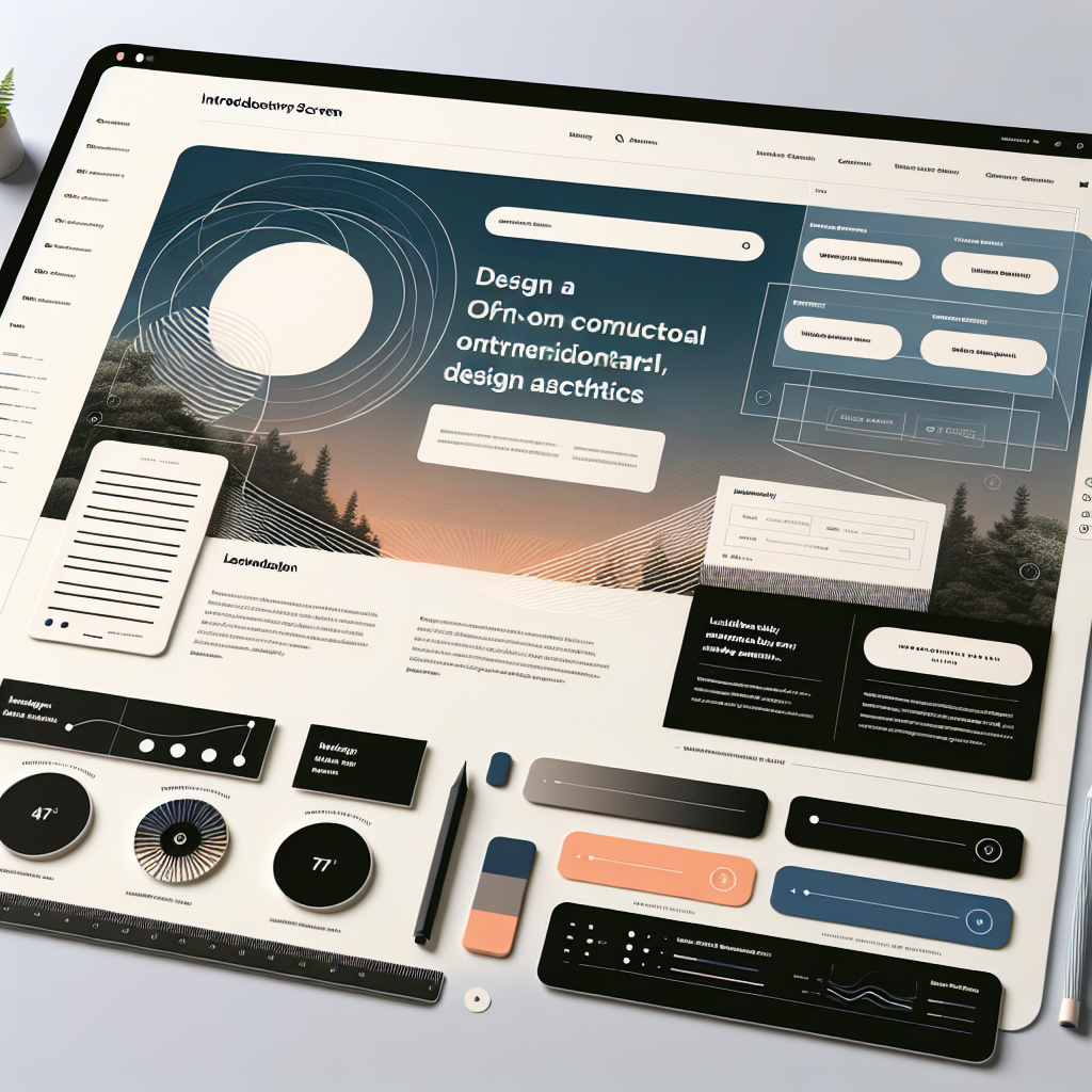
The landscape of web design has undergone a significant transformation over the years. Contemporary web design is now more than just creating aesthetically pleasing websites; it is about offering an exceptional user experience, ensuring accessibility, and optimizing for search engines. At SEON Experts, we understand the importance of staying ahead in this ever-evolving digital world.
Today, web design encompasses a holistic approach that integrates various elements such as responsive design, intuitive navigation, and fast loading times. The aim is to create websites that are not only visually appealing but also functional and user-centric. A well-designed website can significantly impact your brand’s online presence and conversion rates.
One of the key aspects of contemporary web design is its focus on the user. The user experience (UX) is paramount, and designers must consider how visitors interact with the site. This includes ensuring that the site is easy to navigate and that the content is engaging and relevant. Additionally, with the increasing use of mobile devices, responsive design has become a necessity, allowing websites to adapt seamlessly to different screen sizes and devices.
Furthermore, contemporary web design incorporates the latest design trends, such as minimalistic layouts, bold typography, and dynamic visuals. These trends help in capturing the user’s attention and making a lasting impression. Incorporating these elements effectively can set your website apart from the competition and enhance your brand identity.
Ready to elevate your online presence? Call us today at (817) 213-6090 to get started on creating a stunning and user-friendly website that stands out in the digital landscape.
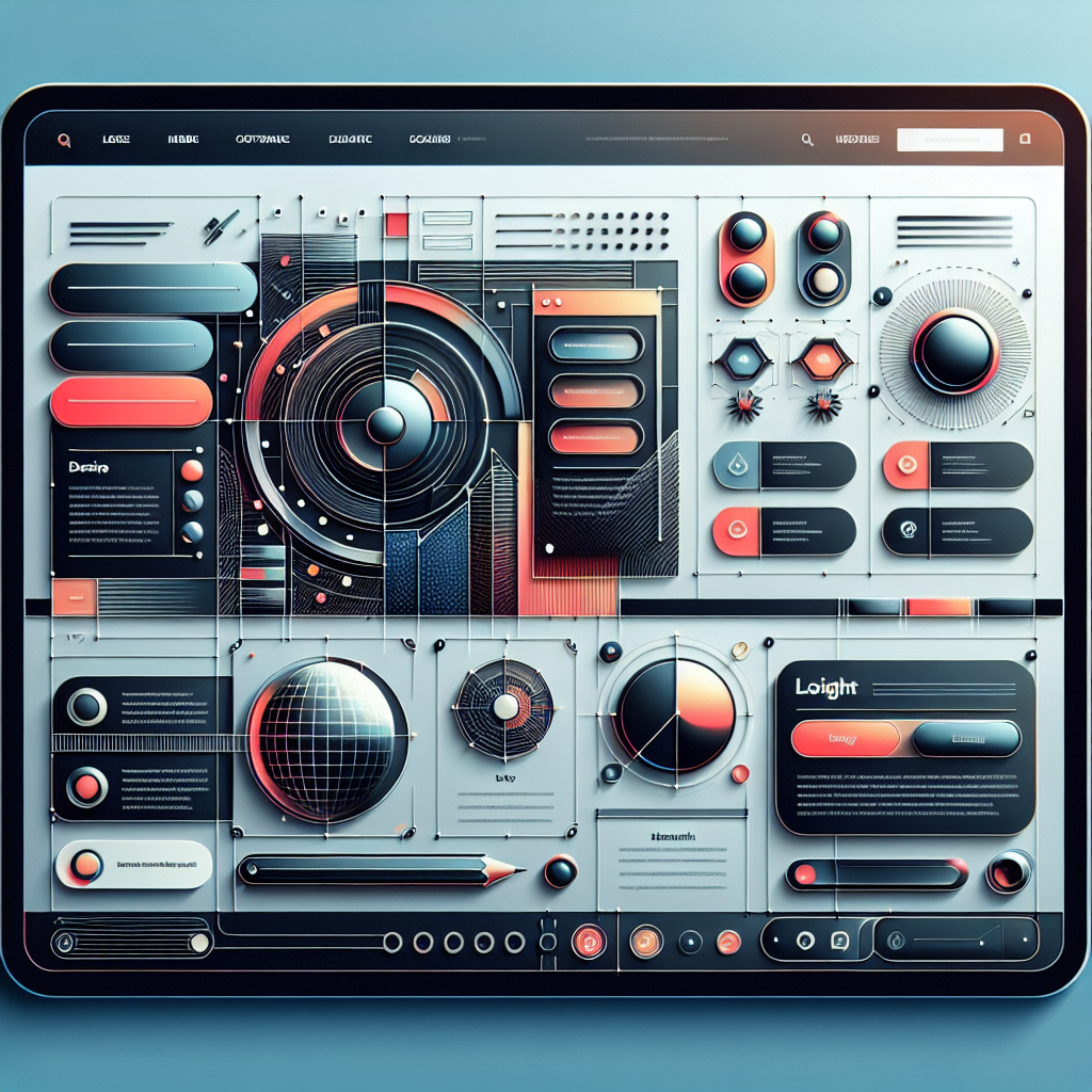
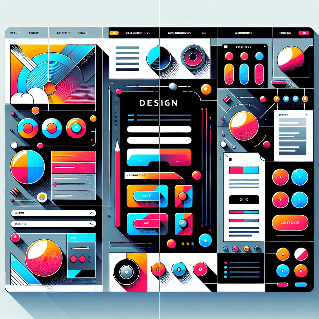
Latest Trends in Web Design

In the fast-paced world of digital design, staying updated with the latest trends in web design is crucial for maintaining a competitive edge. Today’s trends are driven by advancements in technology, changes in user behavior, and evolving aesthetic preferences. Here are some of the most noteworthy trends that are shaping contemporary web design:
- Dark Mode: Dark mode has become incredibly popular due to its sleek appearance and ability to reduce eye strain. Many websites now offer a dark mode option, providing users with a more comfortable viewing experience.
- Minimalism: Less is more in contemporary web design. Clean, simple layouts with ample white space help in highlighting key content and improving overall readability.
- Bold Typography: Strong, eye-catching fonts are being used to create a visual hierarchy and draw attention to important information. Bold typography can make a statement and enhance the user experience.
- Micro-Interactions: Small animations or responses triggered by user actions, such as hovering over a button or scrolling, add an element of interactivity and delight to the user experience.
- 3D Elements: With technological advancements, incorporating 3D elements into web design has become more accessible. These elements can add depth and a sense of realism, making the website more engaging.
- Asymmetrical Layouts: Breaking away from the traditional grid, asymmetrical layouts create a unique and dynamic look, helping websites stand out from the crowd.
- Voice User Interface (VUI): As voice search continues to grow, integrating VUI into web design is becoming essential. This trend focuses on making websites more accessible through voice commands and interactions.
Embracing these trends can help your website remain relevant and appealing to modern users. By integrating these elements thoughtfully, you can create a visually stunning and highly functional website that captures and retains user attention.
Importance of User Experience
In the realm of contemporary web design, the importance of user experience (UX) cannot be overstated. A website’s success hinges on how effectively it meets the needs and expectations of its users. Here are some key reasons why focusing on UX is vital:
1. Enhanced User Satisfaction: A well-designed user experience ensures that visitors can easily navigate your site, find the information they need, and complete desired actions without frustration. This leads to higher levels of user satisfaction, which can translate into increased engagement and loyalty.
2. Improved Accessibility: Good UX design takes into account the diverse needs of all users, including those with disabilities. By making your website accessible to everyone, you not only comply with legal standards but also expand your potential audience.
3. Higher Conversion Rates: When users have a positive experience on your site, they are more likely to take desired actions, such as making a purchase, signing up for a newsletter, or filling out a contact form. Optimizing UX can significantly boost your conversion rates and, ultimately, your bottom line.
4. Lower Bounce Rates: A website that is difficult to navigate or lacks intuitive design can frustrate users, causing them to leave (or “bounce”) quickly. By prioritizing UX, you can reduce bounce rates and keep visitors engaged longer.
5. Competitive Advantage: In a crowded digital landscape, a superior user experience can set your website apart from competitors. By offering a seamless and enjoyable experience, you can attract and retain more users, giving you a competitive edge.
Investing in UX design is not just about aesthetics; it’s about creating meaningful and efficient interactions that enhance user satisfaction and drive business success. By understanding and implementing the principles of UX, you can ensure that your website not only looks good but also performs exceptionally well.
Responsive Design Best Practices
In the era of contemporary web design, responsive design is no longer optional—it’s essential. With the diverse array of devices used to access the internet, from smartphones to desktops, ensuring your website adapts seamlessly to different screen sizes is critical. Here are some best practices for achieving stellar responsive design:
1. Mobile-First Approach: Start by designing for the smallest screen and gradually add more features and enhancements for larger screens. This approach ensures that the core functionalities are optimized for mobile users, who make up a significant portion of web traffic.
2. Flexible Grid Layouts: Use fluid grids to create layouts that scale proportionally. Instead of fixed widths, employ percentages to define the width of columns and containers, allowing content to resize dynamically with the viewport.
3. Media Queries: Implement CSS media queries to apply different styling rules based on the device’s characteristics, such as width, height, and orientation. This allows you to customize the design for various devices without altering the HTML structure.
4. Scalable Images: Optimize images to ensure they load quickly and display correctly on all devices. Use responsive image techniques, such as the <picture> element and the srcset attribute, to deliver the appropriate image size based on the user’s device.
5. Touch-Friendly Navigation: Ensure that buttons, links, and interactive elements are easily tappable on touchscreens. This includes using larger touch targets and providing adequate spacing between elements to prevent accidental clicks.
6. Performance Optimization: A responsive website must also be fast. Minimize the use of heavy scripts, compress files, and leverage browser caching to enhance loading speeds across all devices.
7. Consistent User Experience: Maintain a consistent look and feel across all devices. Users should have a seamless experience, whether they’re visiting your site from a mobile phone or a desktop computer.
By adhering to these best practices, you can ensure that your website offers a superior user experience regardless of the device being used. Responsive design not only improves accessibility and usability but also boosts your site’s search engine rankings, making it an indispensable aspect of contemporary web design.
Integrating Multimedia Elements
Incorporating multimedia elements is a powerful way to enhance the user experience and make your website more engaging and visually appealing. In the context of contemporary web design, the effective integration of multimedia can set your site apart from the competition. Here are some key considerations for integrating multimedia elements seamlessly:
1. High-Quality Images: Use high-resolution images that are relevant to your content and brand. Ensure they are optimized for web use to prevent slow loading times. Tools like WebP and lazy loading can help achieve this.
2. Engaging Videos: Videos can convey complex information quickly and effectively. Consider embedding videos that offer tutorials, product demonstrations, or customer testimonials. Use platforms like YouTube or Vimeo for hosting to save bandwidth and ensure smooth streaming.
3. Interactive Infographics: Infographics are a great way to present data and statistics in a visually appealing manner. Make them interactive by incorporating hover effects or clickable elements to provide additional information.
4. Audio Elements: Audio can add an extra dimension to your content, whether it’s background music, podcasts, or sound effects. Ensure that audio elements are not intrusive and provide controls for users to adjust volume or mute as needed.
5. Animation and Motion Graphics: Subtle animations and motion graphics can draw attention to important elements on your page. Use CSS animations or JavaScript libraries like GSAP to create smooth and engaging animations.
6. Accessibility Considerations: Always ensure that multimedia elements are accessible to all users. Include alternative text for images, transcripts for videos, and captions for audio content to cater to users with disabilities.
7. Performance and Responsiveness: Multimedia elements should not compromise the performance of your site. Optimize file sizes and use responsive design techniques to ensure that multimedia content adapts well to different screen sizes and devices.
By thoughtfully integrating multimedia elements, you can create a more dynamic and interactive user experience. This not only keeps visitors on your site longer but also enhances your brand’s storytelling capabilities, making your website a key player in the realm of contemporary web design.
SEO Techniques for Modern Websites
In today’s competitive digital landscape, mastering SEO techniques is crucial for ensuring that your modern website ranks well on search engines. Implementing effective SEO strategies can significantly enhance your site’s visibility, drive organic traffic, and ultimately, boost your ROI. Here are some essential SEO techniques for contemporary web design:
1. Keyword Research and Optimization: Conduct thorough keyword research to identify the terms and phrases your target audience is searching for. Use these keywords strategically in your content, meta tags, headers, and URLs to improve your search engine rankings.
2. Quality Content Creation: Create high-quality, relevant, and engaging content that provides value to your users. Search engines prioritize content that is informative, well-written, and regularly updated. Incorporate a mix of text, images, videos, and infographics to keep your content fresh and engaging.
3. Mobile Optimization: With the increasing use of mobile devices, having a mobile-friendly website is essential. Ensure your site is responsive and provides a seamless user experience across all devices. Google uses mobile-first indexing, so a mobile-optimized site can significantly improve your SEO rankings.
4. Page Speed and Performance: Page speed is a critical factor in SEO. Optimize your site’s performance by compressing images, leveraging browser caching, and minimizing JavaScript and CSS files. Use tools like Google’s PageSpeed Insights to monitor and improve your site’s loading times.
5. Secure and Accessible Website: A secure website (HTTPS) not only protects user data but also boosts your search engine rankings. Additionally, ensure your site is accessible to all users by following web accessibility guidelines and providing alternative text for images, transcripts for videos, and proper heading structures.
6. Structured Data Markup: Implement structured data markup (schema.org) to help search engines understand your content better. This can enhance your search engine listings with rich snippets, providing users with more information and increasing click-through rates.
7. Backlink Building: Earn high-quality backlinks from reputable websites to improve your site’s authority and search engine rankings. Focus on creating shareable content, guest blogging, and building relationships with industry influencers to acquire valuable backlinks.
By integrating these SEO techniques, you can ensure that your modern website not only looks great but also performs exceptionally well in search engine results. Ready to take your SEO to the next level? Call us today at (817) 213-6090 to learn how SEON Experts can help you achieve unparalleled online success.